 Cape Wind has been stalled for years and recently lost its contracts with utilities, a potential end to their dream of being (as their site currently claims) “America’s first offshore wind farm.” Deepwater Wind, however, recently got a green light on a major financing deal and will begin construction in 2015. Deepwater will in fact be America’s first offshore wind farm.
Why was one wind company brand successful while the other may fail? While many factors were at play, it’s clear to me that the power of wind company branding played a significant role. Full disclosure: my company created the brand for Deepwater Wind. I point this out not to boast, but to share with you some insights gleaned from the brand’s development that can help other companies be successful, whether they be in clean energy, automotive, or dog food.
First, take a look at the names and logos of each company. The Cape Wind name includes “Cape.” What does that name evoke? Sunny days at the beach. Relaxing by the water. Beautiful scenery. Now add “Wind” to “Cape.” Just the juxtaposition of the two implies the intrusion of wind turbines into our mental image of the Cape. The Cape Wind logo rubs beach sand into the wound by including a graphic of a big wind turbine. The project itself, which has been planned for Nantucket sound, hit a firewall of protest from day one, which continued for over a decade. Lawsuit after lawsuit, delay after delay. Why? The name and logo and the project had one thing in common: visibility. The turbines would be highly visible, and most people – rightly or wrongly – don’t find the turbines to be an appealing addition to the skyline.
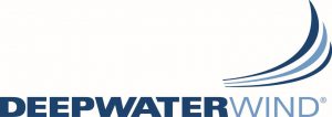
Now look at the Deepwater Wind name and logo. The name “Deepwater” came about because the company had a technology that allowed them to erect turbines farther from shore, in deep water, where they would be less visible. “Deepwater” does not conjure images of a national treasure. It conveys a sense of, well, deep water. Places farther from shore. When you site a turbine in deep water farther off the coast, they tend to be in places with the wind is stronger, allowing for greater energy to be gathered efficiently and at lower cost. And most importantly, they’re less visible from shore. Note that there is no wind turbine in the Deepwater Wind logo. The word “wind” says enough, without emphasizing the one thing most people don’t like about wind energy – the big turbines. Note also the logo is in various shades of blue, a color that instills a sense of financial solidity and trust. In addition, the font we used is bold, conveying power. The upturned lines above the word “wind” convey a range of positive associations, such as waves cresting, and the rush of wind across the deep ocean waters. Everything about the Deepwater Wind name and logo mark makes you feel good about them. This is no accident. It’s by design.
Customers will only say “yes” to your company if they like you. To make this happen, your brand has to be engineered with as much thought and care as your technology. And the essential value of the brand has to run like an electric current through your whole company and culture. A great brand isn’t a label, it’s a true and compelling representation of what your company believes and values right down to your core.
To be clear, Deepwater Wind is a success many years in the making; they did a lot of things right, and their brand was only one of the things that played a role in their success. But what’s significant is that it was one of the first things they did right. They were able to build on this solid foundation to tell their story to the world and become a trailblazer in American clean energy.
If you’re interested in more information about wind company branding, check out our Branding & Marketing for Renewable Energy Companies eBook.